

Colour Print Format
The colour model used in lithographic and digital print is known as CMYK. Designs for
The colour model used in lithographic and digital print is known as CMYK. Designs for

Lithographic and digital printing use a wide range of materials and sizes, and it’s important

The first step is to choose your required product from our range. To calculate a
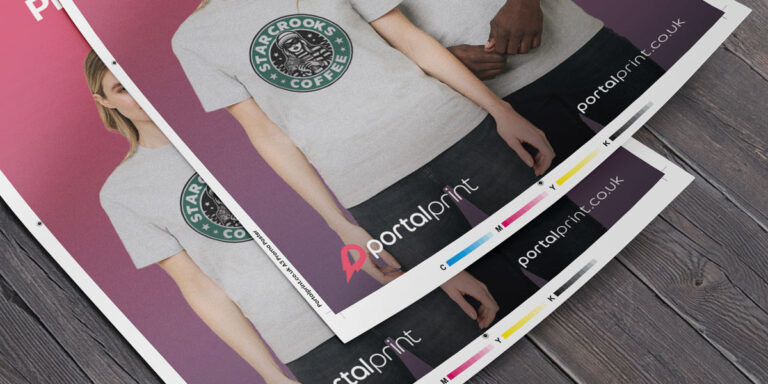
Prepare your files for print by following our quick checklist below to ensure maximum compatibility
The colour model used in lithographic and digital print is known as CMYK. Designs for print should always be started in CYMK, so that the end result is closer to what is seen on screen. Many designers use Pantone colour swatch books to reference process colour mixes, ensuring colour consistency across the project.
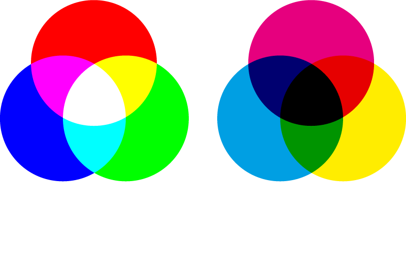
A printed image is made up of tiny dots, which overlap to create different colours and shades. These dots are made up of four colours; Cyan Magenta, Yellow and Black (Key) and white is usually the paper or print media. Viewed close up, or under a microscope, dots can be seen (as in the example below), but at a distance the eye sees the image as a full colour photograph or image. The best example of this is newspapers, where the dots are larger (lower resolution) and can be seen more clearly than high-end magazines. With CMYK printing, the more ink added to the mix, the darker the image. This is known as subtractive mixing.

RGB stands for Red, Green and Blue, and is intended for digital content, such as websites and television. RGB creates an image on screen by passing white light through Red, Green and Blue subpixels. The more light, the brighter the picture; if all subpixels are off, the screen will be black and all on will be white. By varying the intensity of red, green, and blue subpixels, the screen can accurately produce millions of different colours. This is known as additive colour mixing.

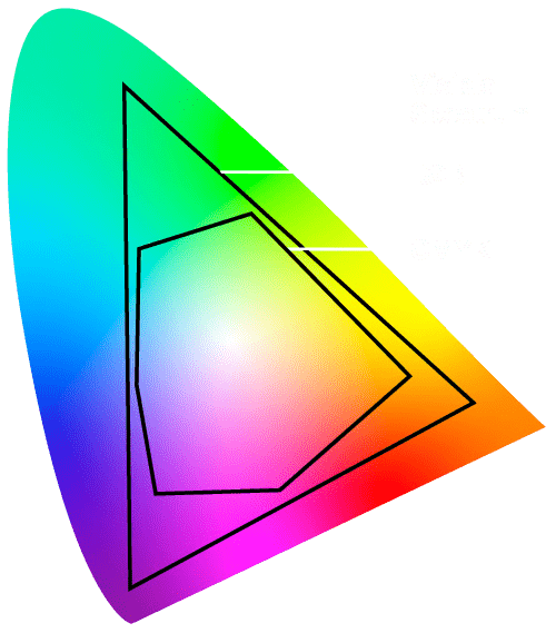
RGB can be converted to CMYK but, as there are vasty less colours available in CMYK (thousands, compared with millions), conversion to the closest equivalent will occur; any colours outside the CYMK colour space will be brought back into gamut, which could mean a dramatic shift, especially with greens and blues, and colours could appear washed-out or inaccurate when printed.
When printing with inks, it is wise to consider the paper stock as a factor. Bond paper such as 80gsm copier paper will soak up more ink and reflect less light than glossy paper, meaning colours will appear less vibrant. The colour of the paper stock itself will also impact your colours, as shown in the example below.
